Cloudalize has some big news!
The navigation of our powerful and user-friendly platform is the latest element to receive a well-deserved update. The team here has focused on making your working day easier to harmonise the navigation and reduce the number of clicks to get you where you want to go faster.
T’was last summer when Cloudalize rolled out a refreshed User Design (UI). The new UI is designed to make your journey to the Cloud through the Cloudalize portal straightforward and simple. It was not possible last year to bring you the navigation but today, it is ready.
It brings a new level of clarity and consistency to your working day.
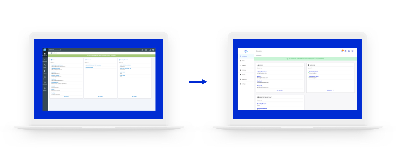
Image: Cloudalize’s Dashboard User Interface Update in Summer 2019
On the previous version, the navigation was in two locations: on the left-side and on the top-right.
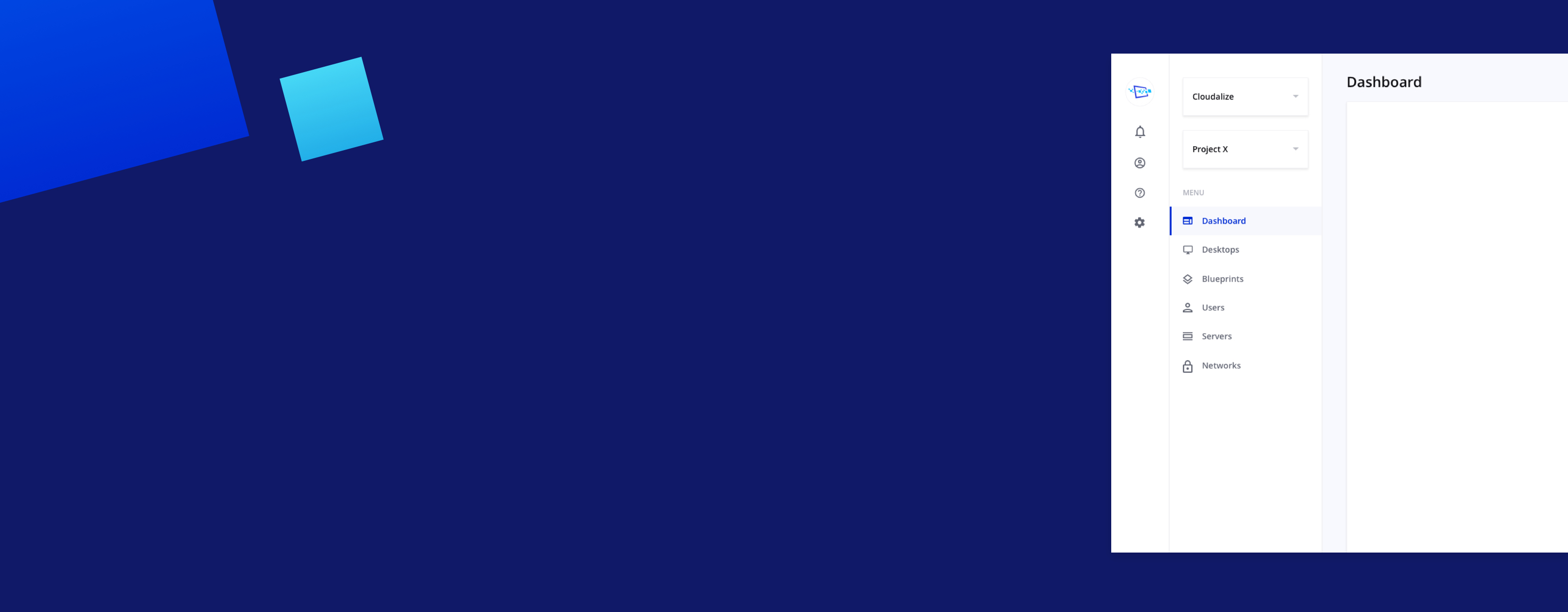
From today, Cloudalize users will find that there are no longer icons on the top-right but they are now merged into the new navigation on the left-hand side. The icons have not changed and you still have the same access points as before.
The main menu includes:
- Notifications
- Billing
- Profile
- Settings
- Support
- FAQ
- Log Out
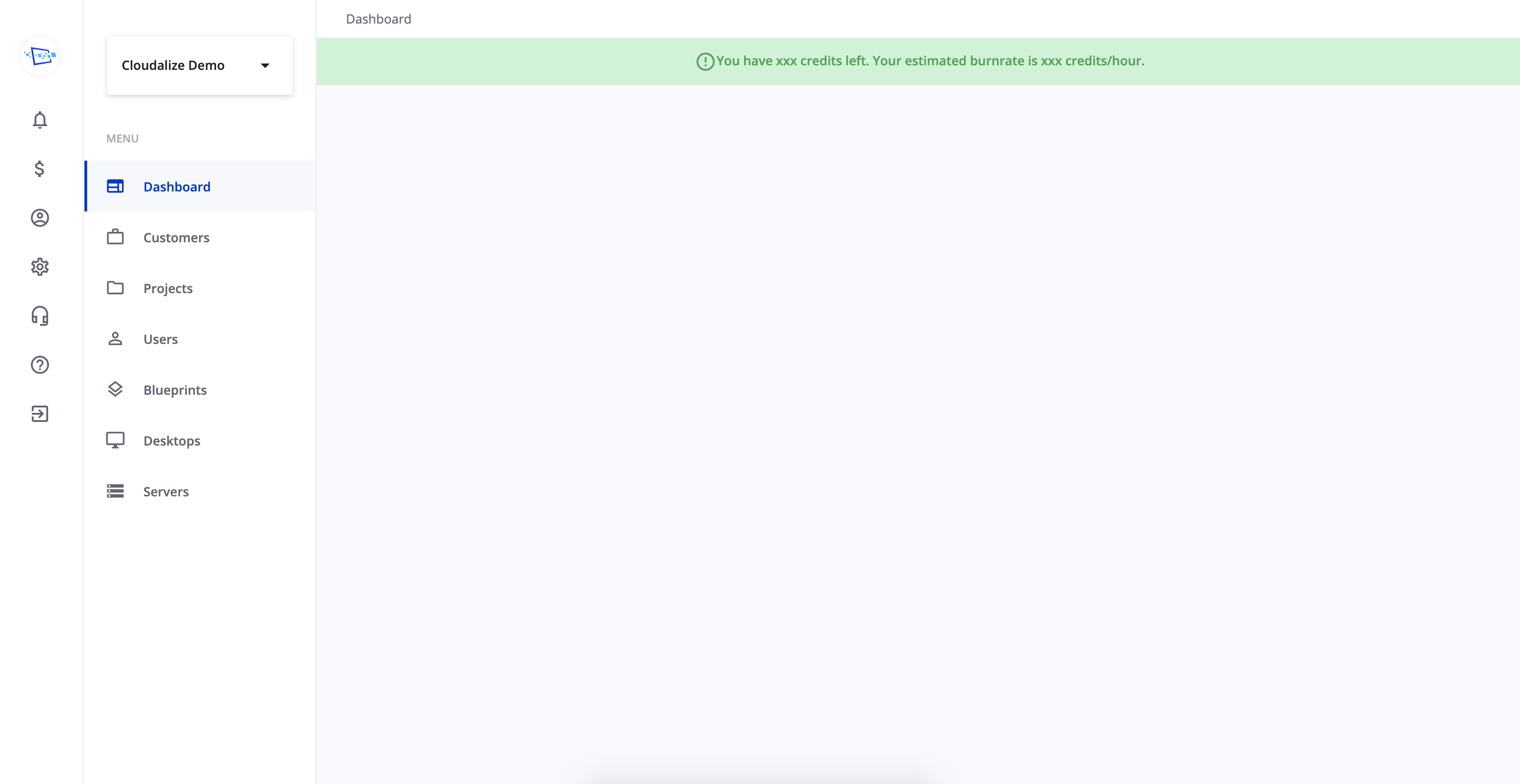
Image: Cloudalize’s Dashboard Navigation Update February 2020
While the Customer and/or Project Management Level Menu features all the things which are important. These include:
- Customer Dropdown Menu: filter different customers and manage them there (only for resellers)
- Dashboard
- Customers
- Projects
- Users
- Blueprints
- Desktops
- Servers
Further announcements are expected later in 2020 as Cloudalize continues to evolve and improve the platform to meet the current and future needs of customers like you.
Author: Caroline Verellen
UX Designer